Jul 30, 2026
We Rebuilt 75% of Our Website for Mobile. It Was Basically Two Sites.
A technical product with a lot of content forced us to make a choice. Here’s what we learned. Our developer did not love this project. Not because it was technically difficult — though it was. But because somewhere in the middle of the redesign it became clear that what we were asking for wasn’t a mobile-responsive website. It was two separate websites that happened to share a codebase. Seventy-five percent of the…
A technical product with a lot of content forced us to make a choice. Here’s what we learned.
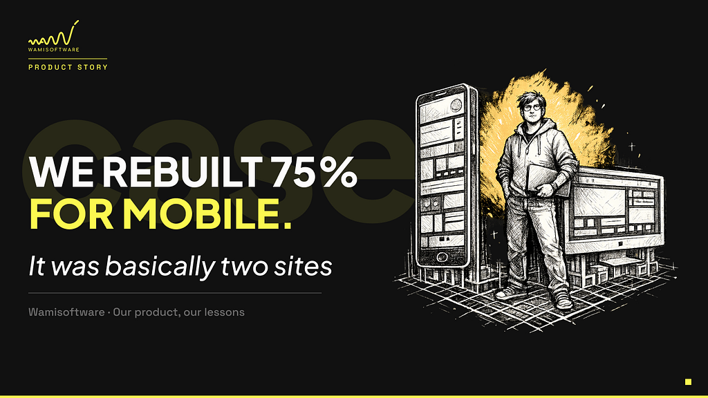
Our developer did not love this project.
Not because it was technically difficult — though it was. But because somewhere in the middle of the redesign it became clear that what we were asking for wasn’t a mobile-responsive website. It was two separate websites that happened to share a codebase. Seventy-five percent of the site ended up genuinely different between mobile and desktop — different content, different ordering, different sections entirely.
That wasn’t the plan when we started. It’s where the plan led us once we got honest about what mobile visitors actually needed.
The Core Insight: Different Device, Different Context
The question we started asking was: what is someone actually doing when they visit us on mobile versus desktop?
The desktop visitor is often in research mode. They’ve found us through a referral, LinkedIn, or a conference mention, and they’re sitting down to evaluate whether we’re worth a conversation. They want depth. They want to understand how we work, see case study details, get a feel for the team.
The mobile visitor is often in a different state entirely. They might be checking us out after a conversation. They might have seen a post and are quickly verifying we’re real and credible. They’re scrolling in a moment of limited attention, often while doing something else.
Those are genuinely different use cases. And trying to serve both with the same content hierarchy meant serving neither well.
What We Actually Changed
Once we framed it this way, the decisions became clearer — though executing them turned out to be harder than expected.
Content prioritization. On desktop, we let users explore. On mobile, we had to make choices about what lands in the first screen and what gets pushed further down. Key information — what we do, who we work with, how to reach us — needed to be immediately visible without scrolling. Supporting detail came later, behind an expand interaction for those who wanted it.
This required actually editing content for mobile, not just rearranging it. Some sections that worked well as full-length text on desktop became one or two sentences on mobile with a “read more” option.
Block ordering. The sequence of information that makes sense for a desktop research session doesn’t always make sense for a mobile check-in. We reordered several sections based on what a mobile visitor is most likely to want to confirm first and kept the desktop layout structured separately for that longer research journey.
Design decisions. Tap targets sized for fingers rather than cursors. Spacing that works for thumb navigation. Interactive elements that don’t require precision clicking. These seem like details but they compound — a technically correct mobile site that’s slightly uncomfortable to use is still a site people leave.
What we removed. Some sections simply disappeared on mobile. Not every piece of content that earns its place on a desktop serves a purpose on a smaller screen. Removing something is a harder call than moving it, but a cleaner mobile experience meant accepting that not everything needs to exist in both places.
The Hidden Cost: Two Sites in One
The most significant thing we underestimated wasn’t the design decisions — it was what those decisions meant for the developer.
When 75% of the site is genuinely different between mobile and desktop — different content, different ordering, different sections — you’re not building one site with responsive breakpoints. You’re building two separate experiences that happen to share a codebase.
For our developer, this meant maintaining two content hierarchies simultaneously. Every update to a section required thinking through both contexts. Every new piece of content required a mobile decision as well as a desktop one. What looks like a design choice on the surface becomes a significant ongoing development consideration.
This is worth naming honestly if you’re considering the same approach: the upfront investment is higher, and the maintenance overhead is real. The payoff is a mobile experience that actually works for how people use mobile. But it’s not free, and pretending otherwise sets up bad expectations.
The Principle Behind the Decision
What we were really doing was rejecting the idea that “mobile-first” means designing small and scaling up. It means understanding what someone is trying to accomplish on each device and designing for that job.
A technical product with a large amount of information faces a specific version of this problem. The information exists for a reason. But the reason someone needs it varies by context. On a desktop research session, comprehensive information is a feature. On a mobile check-in, the same information is friction.
The practical answer is different content hierarchies for different contexts — not different content, but different emphasis, ordering, and depth of what’s immediately visible.
How to Tell the Difference Between a Decision and a Shortcut
There’s a version of this that isn’t a strategic decision — it’s an unfinished mobile site dressed up in the language of intentionality. The test is simple: does the mobile experience feel coherent and considered, or does it feel like pieces are missing?
A deliberate mobile experience has its own internal logic. The user can accomplish what they came to accomplish. Content that’s absent is absent because it wasn’t relevant, not because nobody got to it.
An unfinished mobile experience has obvious gaps. Sections that don’t render correctly. Text that’s too small. Content clearly dropped without thought for what that removes.
The difference is felt immediately.
What We’d Tell Other Technical Teams
If you’re building or redesigning a site for a technical product — especially one with a lot of content — the mobile question is worth treating as a strategic decision rather than a technical implementation.
Start by asking what the mobile visitor is actually trying to do. Accept that some content won’t make it to mobile and make that call deliberately. Test the mobile site with the same rigor as the desktop.
And if you decide to genuinely differentiate the two experiences rather than just compress one into the other go in with clear eyes about what that means for your developer. It’s closer to maintaining two sites than one. For us, it was worth it. But it’s a real commitment, not a design preference.
Our website is a live example of this approach. Look at it on your phone and on your computer — the difference is intentional.
Wamisoftware has been building software products since 2014. We work with startups and enterprise clients on everything from MVP development to complex AI-integrated systems.